Joe's Bakery

Website design & build + art direction
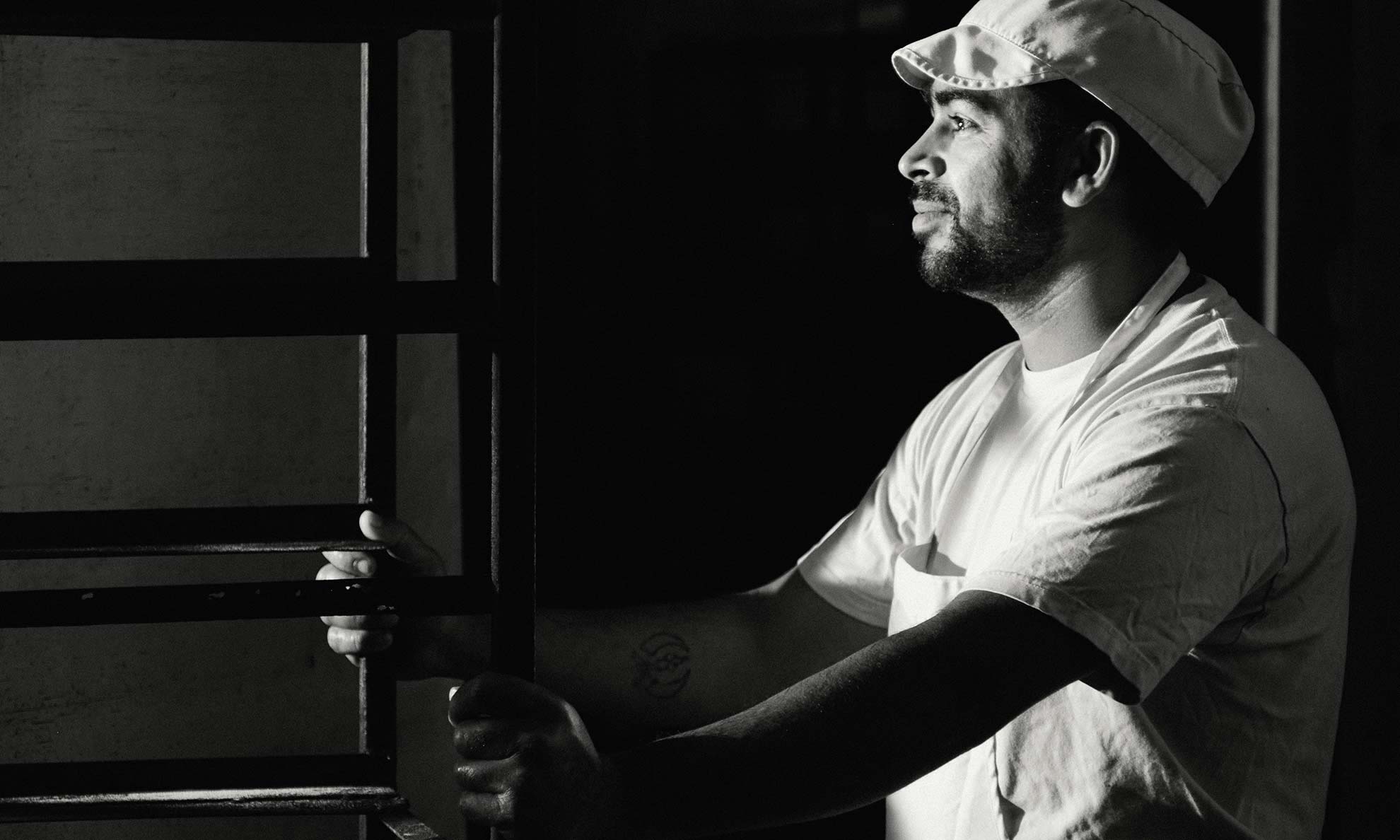
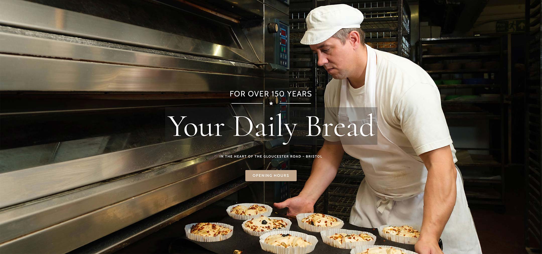
Baker putting bread in oven
CLIENT
Jenny Rogers and Wayne Thick; Martin and Jane Hunt
COMPANY
Joe’s Bakery, Bristol
CLIENT AIM
Replace old website with something fresher and which represented the quality of their products; create a bank of new images to support their new look; ensure images were suitable for both the website and social media use
SKILLS REQUIRED
Web design; business storytelling photography; Art Direction
BACKGROUND
Design and images combine to showcase a much loved community bakery
For many small businesses, marketing is an uphill struggle. They don’t have the luxury of a marketing team or an expensive agency at their disposal. And yet the need to put their best foot forward doesn’t go away.

This was exactly the situation that the owners of Joe’s Bakery found themselves in. With two bakeries in Bristol and a team of in-house specialists, their baking skills
are unquestionable. What they lack is the time, skill and experience to create a beautiful website that does their
business justice. They don’t have the in-house capacity to produce engaging photographs that tell a story.

Outsourcing gave them access to those skills and the outcome is a website to be proud of.
Bread in oven
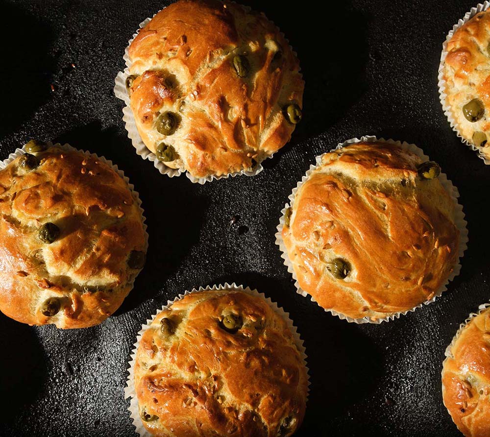
Foccacia in baking tray
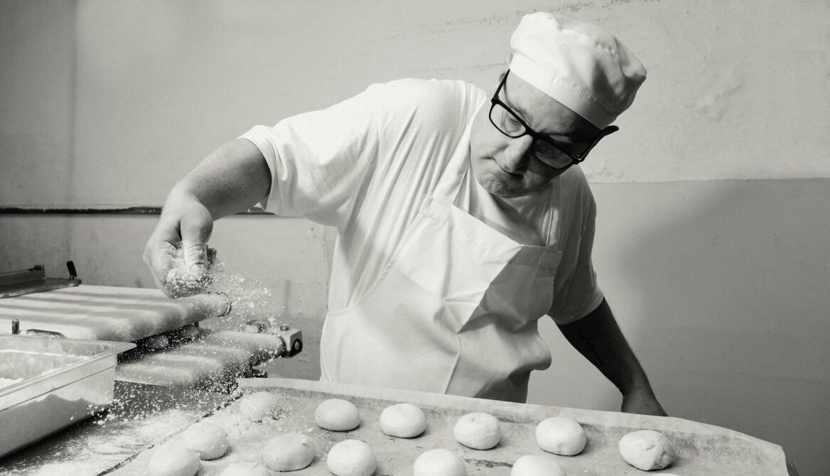
Baker dusting rolls

The brief

To create a fresh, clean new website that shows the true spirit of the business. This was the proposition that Martin Kerslake of Kerslake Design put forward when he introduced himself to the owners.

To work with the existing branding; the client had a logo and shop livery already and didn’t want to change this.

A bakery has stood on the Gloucester Road site of Joe’s Bakery for 150 years. The client wanted to capture the sense of tradition, as well as the business as it is today.

To support and enhance the website with quality photography that tells the business story effectively. This is where Nick Cole Photography came in.

It started with a loaf of bread

Martin has bought and enjoyed quality bread from the bakery for years; one day, he decided to look up Joe’s Bakery online. With his designer’s eye and his experience of building stand-out websites, Martin could see there was room for improvement. It was this spark of vision that secured an initial meeting with the client.

Websites need content like doughnuts need jam

Have you ever bitten into a jam doughnut only to realise that there is a tiny blob of jam in a mountain of dough? It’s a very disappointing experience.

Martin recognised that if he were to create a new website using the existing photos, it would risk leaving the audience disappointed. A few shots snapped on a camera phone wouldn’t be enough to satisfy the appetite of discerning website visitors. Sure, it would look like a website, it would function like a website. But it would lack that delicious, generous dollop of jam in the middle.

To remedy this, Martin enlisted the help of Nick Cole Photography. In sharing his vision for the site, Martin invited another professional onboard – a boon for the client, as two heads are better than one. Nick agreed that there was considerable potential to tell a visual story with the website; his photography skills could bring an extra dimension to the project.

The client was clear that the website and the images should uphold the community feel of the bakery. Martin prepared some ‘flats’ – mock-ups of how the website could look. Nick shared example images to demonstrate the style of photography that would achieve their aims. Together they illuminated the possibilities for the client, held their hand through a process that the team at Joe’s Bakery was unfamiliar with. Martin and Nick were singing from the same hymn sheet and their unity demonstrated to the client that they were in safe hands.
Baker wheeling bread into proofing room

Joe’s Bakery was open for business: navigating the client’s unique needs

The process of having a professionally made website and images was new to the team at Joe’s Bakery. Nonetheless, they had certain unique requirements:

1. Saturday was a complete no-go for any kind of shoot. It’s the busiest day of the week for any retail bakery and there’s no time to think about marketing.

2. A baker’s day begins at around 2am. Afternoon shoots were out, because by that time, all of the ‘back of house’ work would be done; there would simply be no ‘behind the scenes’ baking action to capture!

Martin and Nick were flexible and accommodating to the bakery’s schedule. Arriving on-site at 6.30am, Martin and Nick were primed and ready for action as the rest of the world woke up. From the outset, the brief had been to capture the bakery in its true light. By working around the bakery hours, the pair could tap into the authenticity of the shop and bring life – not just gorgeous images – to the website.

Yeast + sugar and water = magic…
Photographer + Art Director = success

If you’ve never been in the back of a bakery – there’s a lot going on! Bakers knead, roll, and stretch soft dough. Trays clatter as they’re swapped in and out of six-foot-wide ovens. Hot air blasts forth when the door comes down, timers beep, and tall metal trolleys rattle over the tiled floor. Trying to take photographs in that environment is tricky. Nick’s skill with the camera and his cool head were vital assets – because when the dough is ready, it’s got to go into the oven now. There’s no time to set up the ‘perfect’ shot. And yet the resulting images are energetic and vivacious – just like the bakery and the characters within it.

The teamwork between Martin and Nick was also critical for making a success of the project. Nick put people at ease, drawing out their best selves with words of gentle encouragement. He watched the action with a keen eye, so when the right moment presented itself, he was ready to capture it. Meanwhile, Martin spotted opportunities to tell a visual story. A designer that’s engaged and on-shoot to support the process is a rare gift on a project like this. With Martin in his role as Art Director, he wasn’t simply a spotter. He held up the vision the client hoped for and retained control over how the finished website would look.

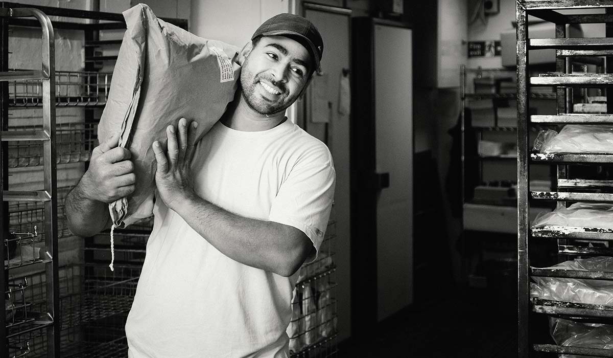
Baker carrying large flour bag

The challenges…

All projects throw up their own set of difficulties. Here are some of the challenges that cropped up, and how Martin and Nick overcame them.

Reluctant models – as is often the case when a team is being photographed, some people are more forward than others! It took a little while for some people to feel comfortable in front of the camera. A little encouragement and the nerves abated. It led to some very warm, engaging shots which capture the ‘friendly’ spirit of the customer-facing side of the business. The photos of the bakers, add a ‘human’ element to a side of the business the public doesn’t usually see. By upholding a ‘business as usual’ approach, rather than going for staged photos, the imagery is authentic.

Setting – Joe’s is a retail bakery – it’s definitely not the enormous empty kitchen that you see Nadia baking in! People were moving around constantly, there were hot ovens to beware of, customers were coming and going… both Martin and Nick had to operate in closely confined spaces, work at pace, capture what was needed and be mindful that they were in the client’s space.

COVID restrictions – there was also the added complication of the COVID-19 protocols. With Perspex screens around the serving area, photographing staff behind the counter was exceptionally tricky. Martin and Nick had to maintain a safe distance whether shooting in the bakery or in the shop alongside customers. The restrictions only added to the creative problem solving deployed by Martin and Nick.
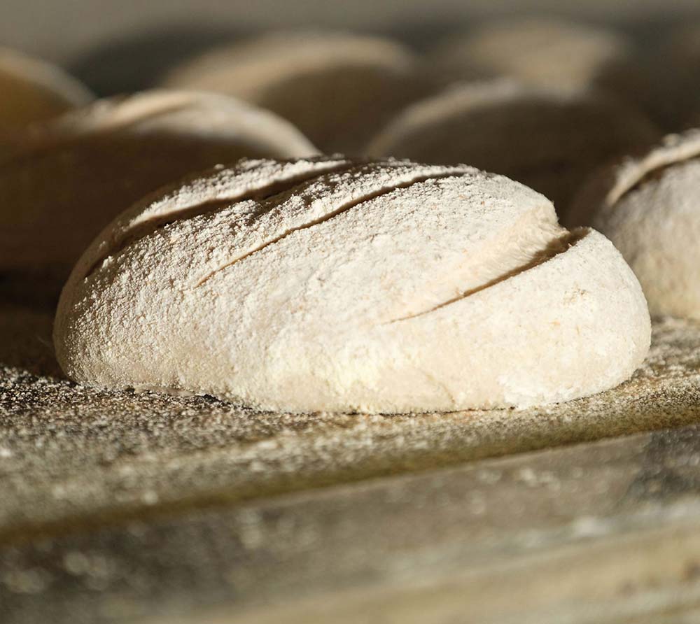
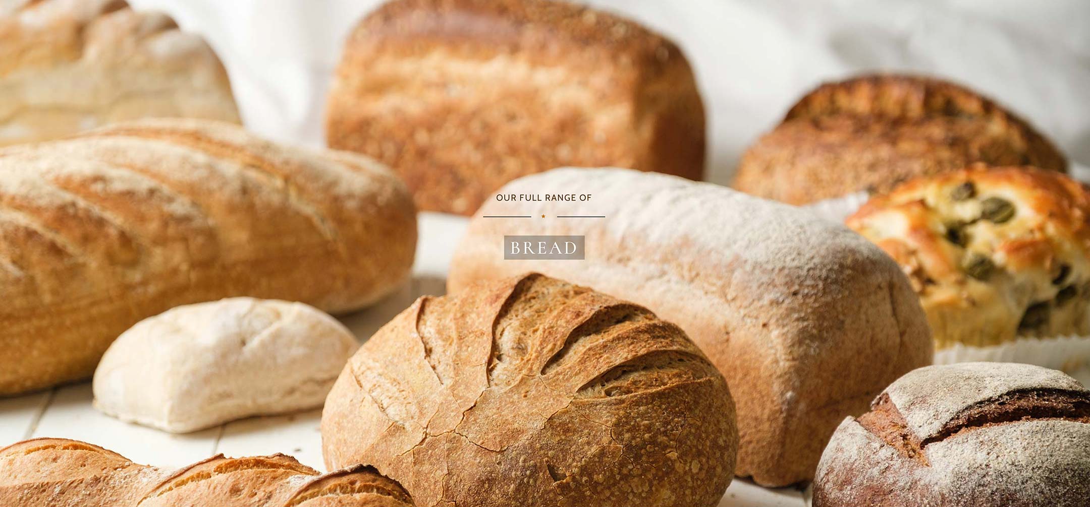
range of bread at Joe's Bakery

Meeting the unexpected with a smile

After the success of the photoshoot with staff, the client decided that they wanted some product photography. While this wasn’t part of the initial brief, Martin was keen to incorporate this as it would provide some rich content for the website.

A purpose-built studio is a luxury; for most clients the reality is a little more down-to-earth. The product photography was realised with a can-do attitude and buckets of creativity. Martin and Nick set up shots while squeezed into backrooms, snapped photos on any spare countertop available – this was the real deal.

Despite the challenges, Martin and Nick had a strong sense of how the photos should look. To achieve this, they spent time sourcing props and building backgrounds. With some panelling, white paint and sandpaper, Martin fashioned an appealing backdrop for Joe’s hero products. Nick brought rustic chopping boards, hessian sack and the pair acquired some cake stands to elevate the sweet treats. While this wasn’t strictly necessary, it adds to the finished product and helps website visitors appreciate what the bakery has to offer.

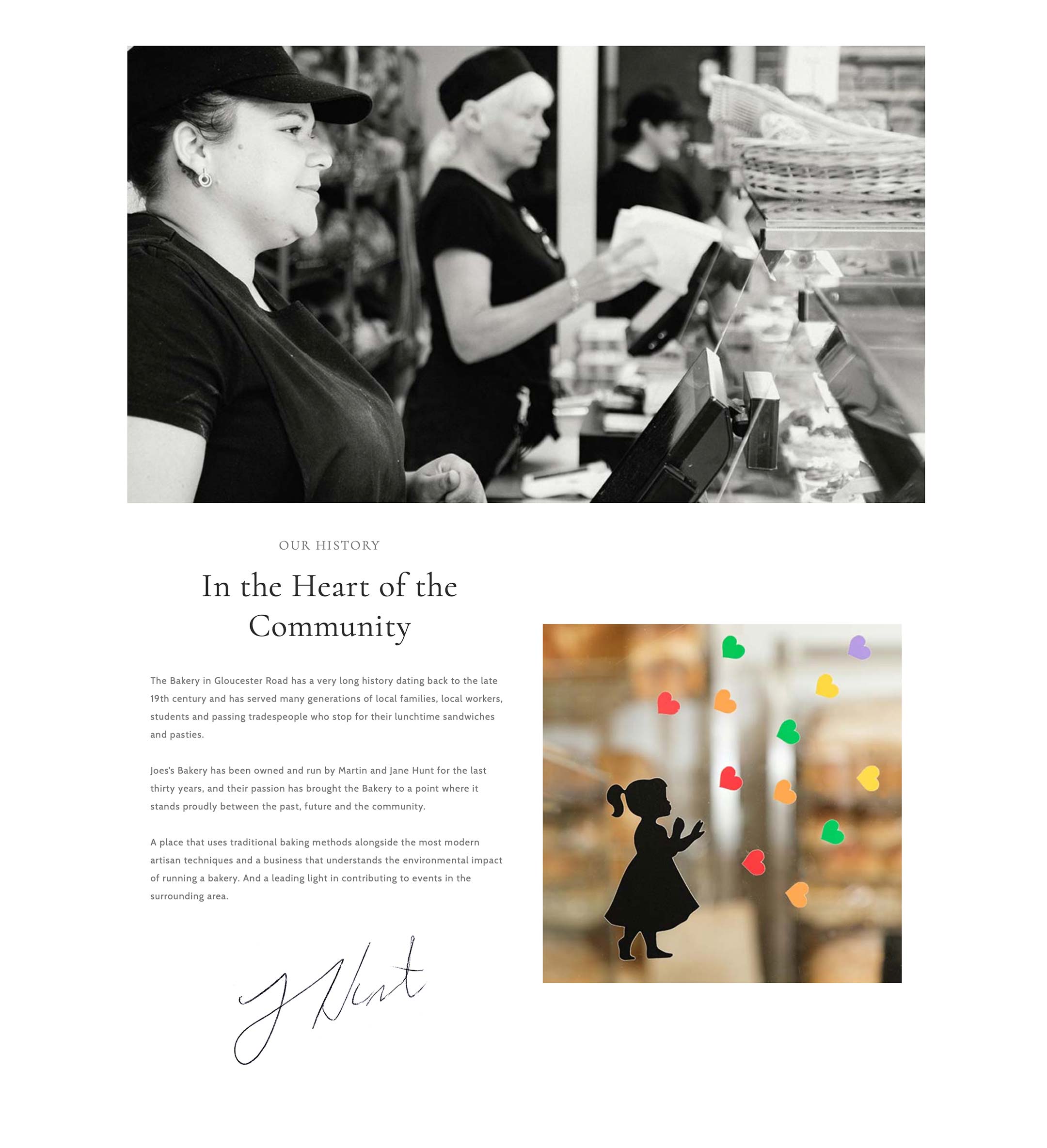
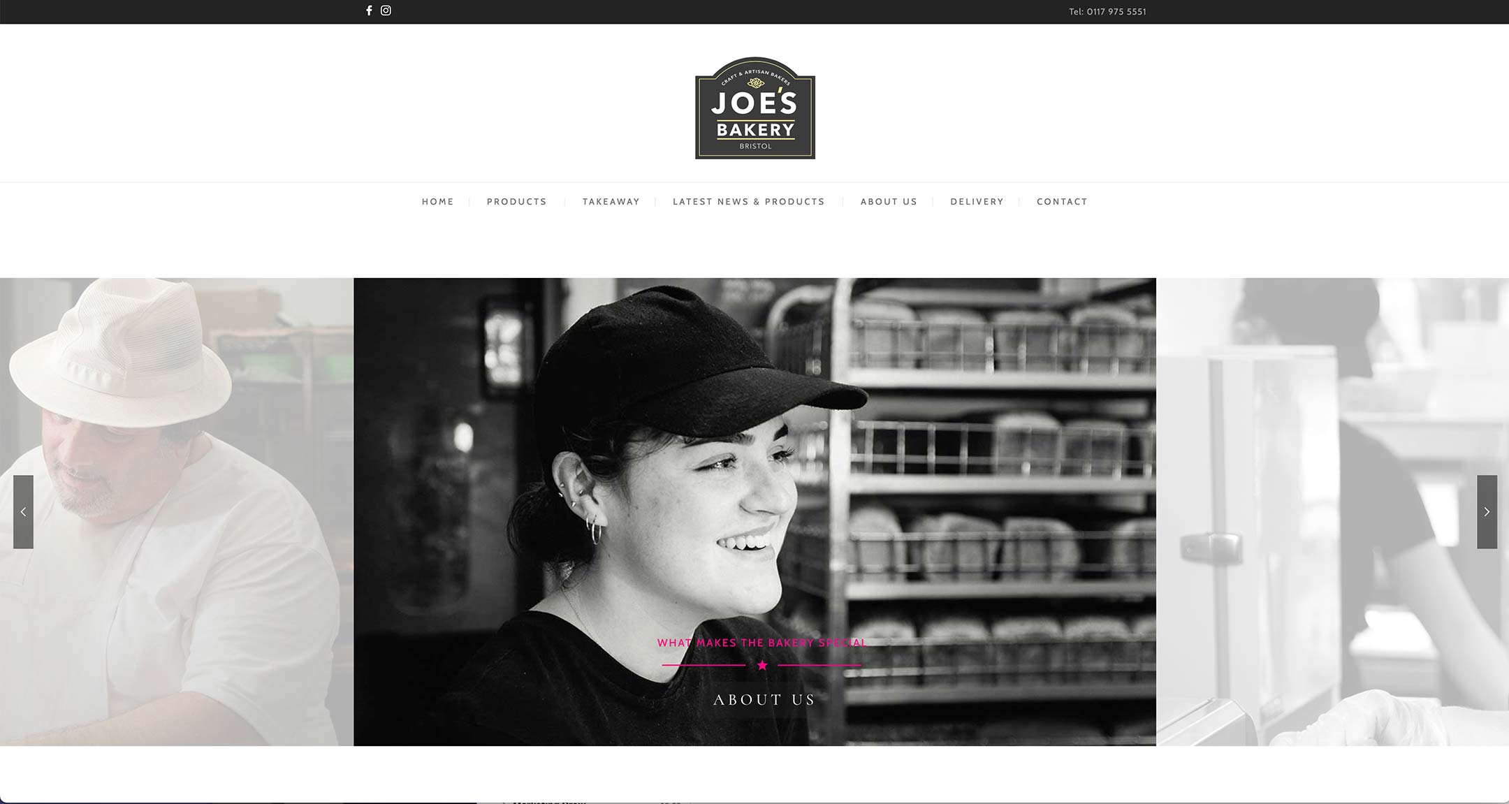
Smiling woman serving behind bakery counter

A new website emerges

You’ll notice that some of the photos on the website are in colour, some are in black and white. The benefit of working with a professional photographer is not only their ability to photograph great images. It’s also their knowledge of how to manage the post-production process. By turning some photos black and white, Nick could sharpen the details of key images and train the eye on action within the shot.

The skill Martin brought to the table was his discerning eye. Presented with a selection of images, he knew exactly where to insert them on the website for best effect. The outcome is a website that depicts Joe’s Bakery at its best. The team at Joe’s places great importance on the quality of their ingredients and their specialist knowledge; now they have a website that aligns with those values.
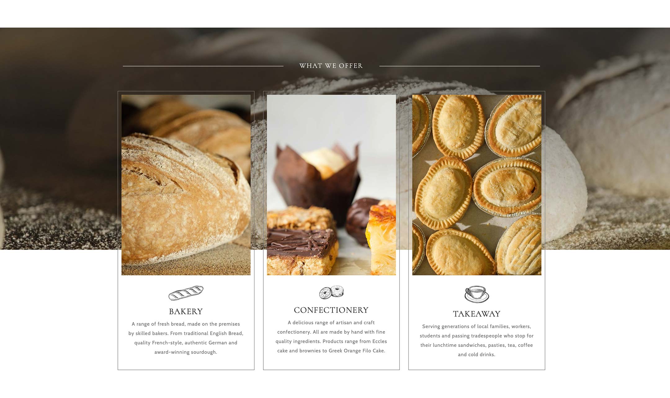
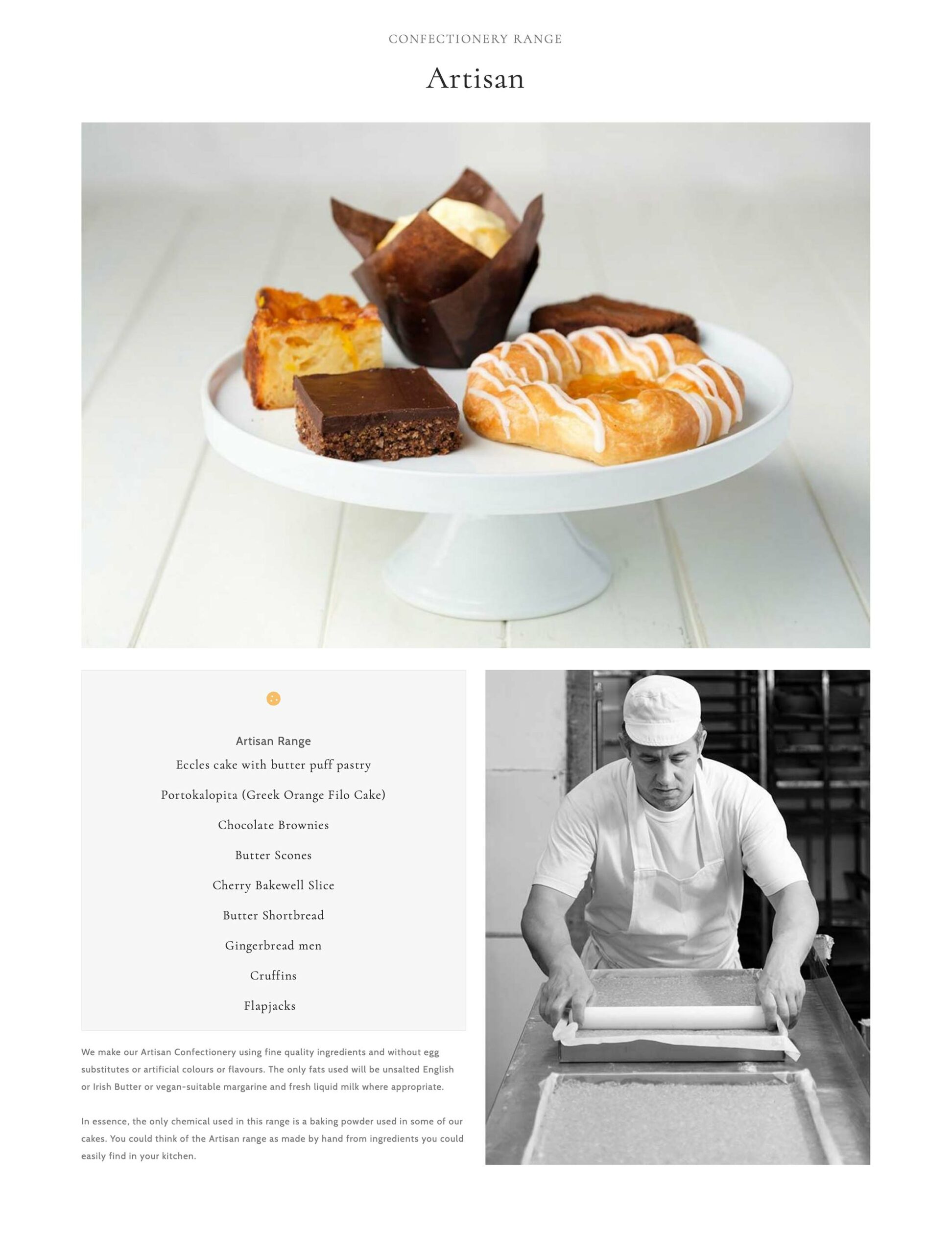
Joe's Bakery confectionery range

Reflections on completion of the job – a collaboration is greater than the sum of its parts

Had Martin created a great website and included images shot on a mobile phone, the impact of the site would have been reduced. The reverse is true also – professional images with a less-than-stellar website wouldn’t look impressive. Professional website design and professional photography elevate the final product to a level that either one service – design or photography – couldn’t achieve on its own.

They say that two heads are better than one. But really, the benefits that the client feels when professionals collaborate runs deeper than that. To work with another professional, you have to be receptive to different ideas, perspectives, and methods. This reciprocity shows up in Martin and Nick’s sensitivity to the client’s needs also. An atmosphere of mutual respect translates to a positive working environment and a better outcome for the project.

For many clients, who don’t have an in-house marketing team at their beck and call, hiring a professional is a leap of faith. But hiring two?! As the outcome for Joe’s Bakery demonstrates, it leads to double the ideas, double the skill and double the impact.

Interested in taking your online presence to the next level? Get in touch…

kerslake design logo
Nick Cole photography logo
Martin Kerslake, Kerslake Design
www.kerslakedesign.com
07740 087 874
Nick Cole, Nick Cole Photography
www.nickcolephotography.co.uk
07410 634 158
linkedin facebook pinterest youtube rss twitter instagram facebook-blank rss-blank linkedin-blank pinterest youtube twitter instagram